A record sleeve is the printed cardboard jacket that holds a 12-inch LP, and designing one is mostly a specification job rather than a talent job. You build a single artwork file that contains the front, back and spine panels laid flat, add bleed past the trim lines, set everything in CMYK at 300 ppi with the fonts outlined, then hand it to a printer who cuts, folds and creases it into the sleeve you hold.
That takes an afternoon for a first attempt and a weekend if you want the finishes. The part that trips people up is not the artwork, it is the numbers. Pressing plants quote jacket sizes differently, templates arrive with bleed already built in or deliberately left out, and small text near a fold disappears under a record. Get those three things right and the rest is typography.
This guide covers the whole route: picking the right format, building the layout around the physical sleeve, preparing the file, and assembling the finished jacket without damaging the record. It works whether you are pressing your own release or just designing a sleeve for a record you already own.
Table of Contents
- What You Need
- Core items
- Optional, depending on how you are printing
- Key terms you will meet immediately
- Step-by-Step: How to Design a Record Sleeve
- 1. Define the Sleeve Size and Format
- 2. Establish the Visual Direction
- 3. Create the Front, Back and Spines Layout
- 4. Refine the Typography and Artwork
- 5. Proof, Print and Finish the Sleeve
- 6. Assemble and Protect the Record
- Common Mistakes
- A printable pre-flight checklist
- Frequently Asked Questions
- What is the size of a standard record sleeve?
- What resolution do I need for vinyl artwork, and is 2000×2000 pixels enough?
- Should I use CMYK or RGB for vinyl artwork?
- Can I design a record sleeve in Canva or another free tool?
- What is press shifting and how do I design around it?
- Can I print my own sleeve if I am not pressing vinyl?
- Conclusion
What You Need
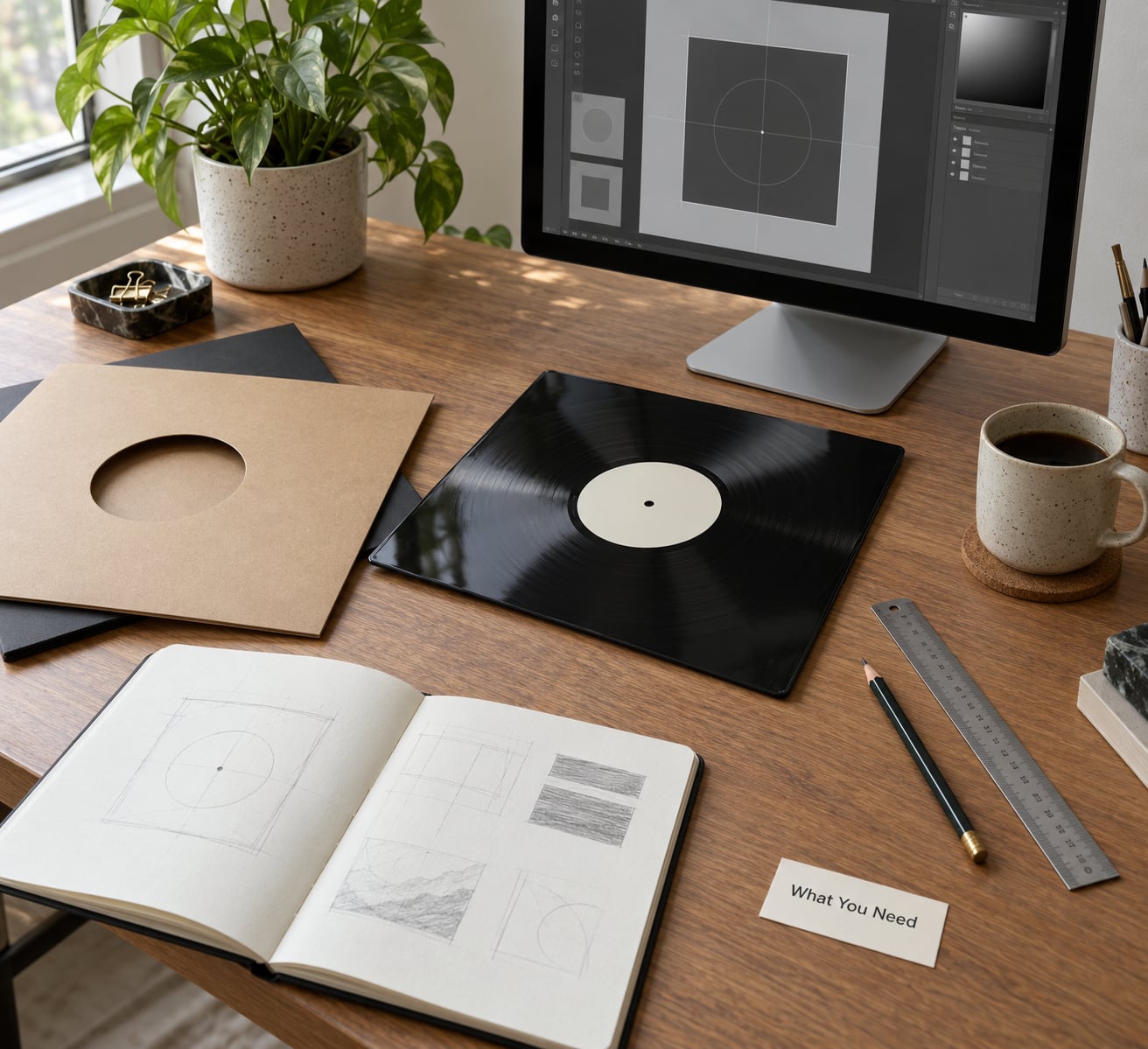
The full kit falls into four groups: the template, the artwork, the typography, and the things you use to check the work before it goes to print.
Core items
| Record sleeve template | A pre-built file from the plant or record supplier you are working with, in the exact size that plant prints. Never guess this from a random download. |
| Artwork source | Photography, illustration or type at 300 ppi minimum at final print size. Larger is fine; smaller is not. |
| Layout software | Adobe InDesign or Illustrator for serious work. Photoshop, Affinity, GIMP or Canva all work for a straightforward jacket. |
| Fonts | Two families at most. Download the actual font files rather than relying on a cloud font library the printer will not have. |
| Ruler and pencil | For checking panels, spine width and safe margins against the template guides. |
| Blank card and a printer | Only if you are printing the sleeve yourself at home rather than going to a plant. |
Optional, depending on how you are printing
A paper mock-up kit is worth having even if someone else handles the printing. Print the artwork at home on card, fold it, cut it, and slot a record in. It takes twenty minutes and it catches the errors no on-screen proof ever will.
Two other things are optional. Shrink wrap and a disc inner sleeve only matter if you are finishing a real pressing, and spot gloss or foil only exist as layers if your printer offers those finishes. Ask before you design for them rather than after.
Key terms you will meet immediately
Four words carry most of the confusion, so it is worth pinning them down now.
- Trim size is the finished size of the cut sleeve, measured at 12.375 inches (314 mm) square for a standard 12-inch jacket.
- Bleed is the artwork that extends beyond the trim line so no white edge shows after cutting. Three millimetres on every side turns that into 12.75 inches (324 mm).
- Safe area is the zone inside the trim where anything important lives, so cutting tolerance and folding never eat it.
- Pre-flight is the final check of the file before it leaves your hands: colour mode, resolution, fonts, bleed, ink coverage.
Step-by-Step: How to Design a Record Sleeve
1. Define the Sleeve Size and Format
Start by deciding which physical object you are designing for, then take the exact dimensions from the supplier making it. A standard 12-inch LP jacket is 12.375 inches (314 mm) square trimmed, and the artwork file is usually 12.75 inches (324 mm) square to allow for 3 mm of bleed.
This is where first-time designers lose an afternoon, because different plants describe the same jacket differently. Some templates arrive at 12 inches with no bleed, some arrive at 12.375 inches with bleed already built in, and some ask for 12.5 inches. Templates in circulation disagree on this, and both versions are real files that real plants expect you to work inside.
| Component | Trim size | With bleed | Notes |
|---|---|---|---|
| 12-inch LP jacket | 12.375 in (314 mm) | 12.75 in (324 mm) | The standard record sleeve. Front, back and spine on one sheet. |
| LP inner sleeve | 12.375 in (314 mm) | 12.75 in (324 mm) | Generic printed or solid-colour inner. Usually plain is fine. |
| Gatefold jacket | 12.375 in (314 mm) | 12.75 in (324 mm) | Adds a spine panel between front and back. Spine width varies by plant; ask. |
| Boxset sleeve | 12.375 in (314 mm) per panel | 12.75 in (324 mm) | Spine widens with each disc included. Confirm the count first. |
| Center label | About 4 in (101.6 mm) diameter | Plant supplies exact size | Do not draw a centre hole. Labels are baked in the steam press. |
| 7-inch single sleeve | 7.25 in (184 mm) | Plant template | Different artwork file entirely, not a scaled-down LP. |
Two more decisions belong here. Opening style matters: a side-opening sleeve has the spine on the left and opens like a book, while a top-opening sleeve has the spine at the top and slides down. Most plants default to side-opening and will tell you if they cannot do otherwise.
How do you know the step worked? Open the template file and check that the trim lines, spine guides and fold marks are present as a locked layer. If your file has no guides, you have the wrong template, and everything downstream will be slightly off.
2. Establish the Visual Direction
Turn the record’s sound into one visual idea before you open any layout software. The strongest sleeves are decided in a sentence first: a photograph of the rehearsal room window at 4am, a single word set enormous on flat colour, a hand-drawn diagram of every song on one side.
Pick the palette from the music rather than from taste. Two or three colours you can name out loud is plenty, and one of them should contrast strongly enough to carry text against an image. If the record is loud and saturated, a quiet sleeve with a lot of black can be a deliberate counterweight rather than a lack of effort.
For type, choose one display face and one working face, and no more. A geometric sans in wide caps handles a track list well; a serif or condensed face reads better on a spine where the letters stack vertically. Test every candidate at the size it will actually appear, which for a track list is small.
Decide between photography and illustration before you shoot anything. If you are working from photographs, look at existing sleeve art for lighting and composition, not for content. Building a moodboard with three references you admire and two you deliberately dislike keeps the direction honest.
The step is done when you can describe the front cover in one sentence without using the word “vintage” or “retro”. If you cannot, the idea is still a mood rather than a direction.
3. Create the Front, Back and Spines Layout
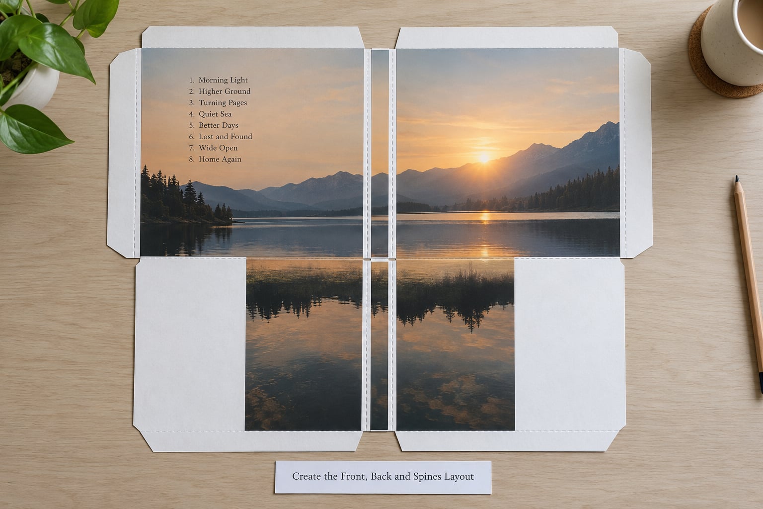
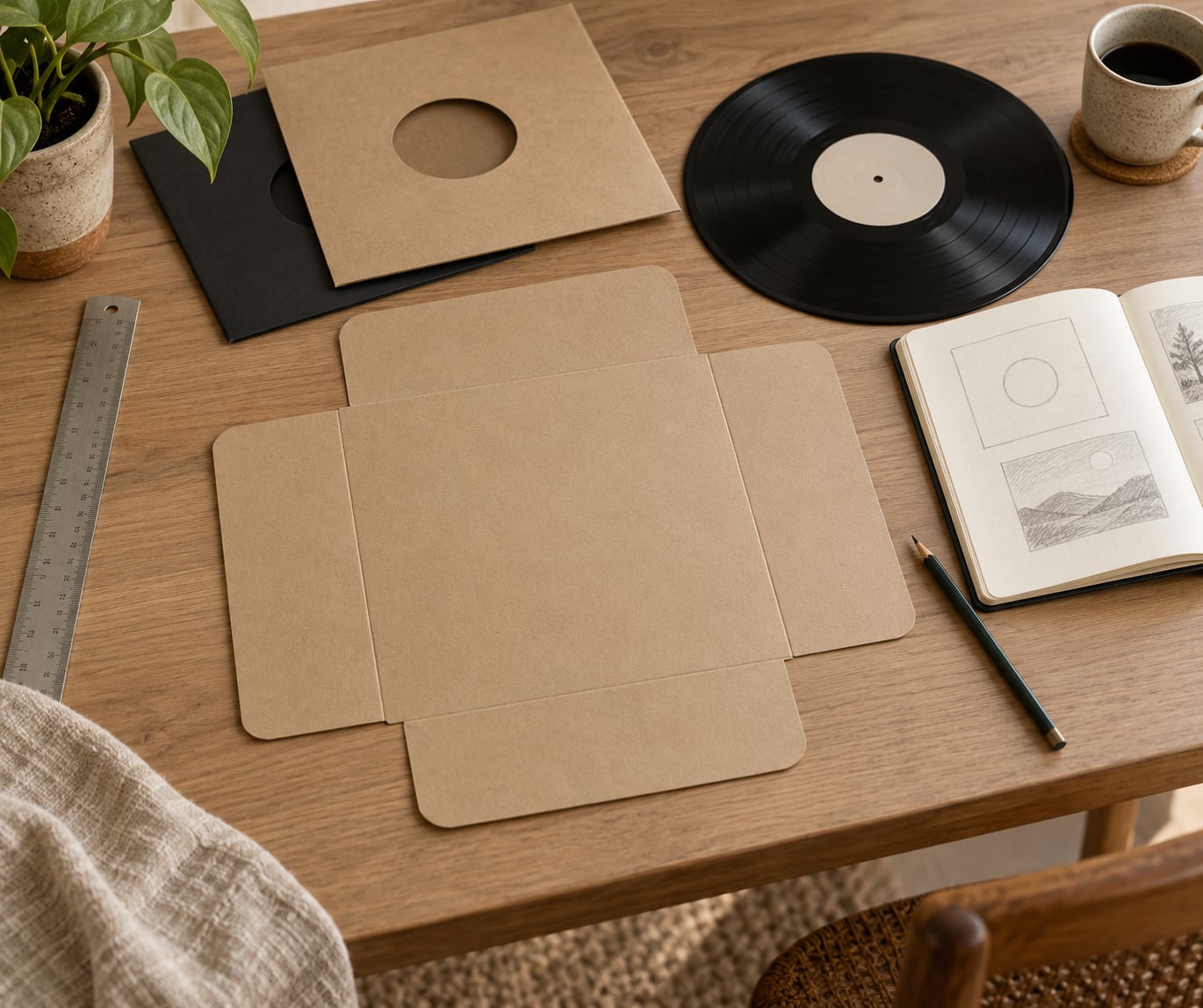
Lay out the whole flat sheet rather than designing the front cover on its own. The jacket prints as one piece and folds afterwards, so the back cover has to share the same canvas and the same grid as the front.
Front panel carries the image, the artist name and the album title. That is enough. Back panel carries the track list with running times, the credits, the label name and catalogue number, and the barcode. The spine carries the artist and title rotated so they read when the record sits on a shelf.
Hierarchy is what makes a back cover usable. Make the track list the largest type on that panel, then step the credits down, then the legal and manufacturing text. Reviewers and collectors genuinely read back covers, which is rare for any other kind of packaging.
Alignment does more work than you expect. Set the back cover content on the same margins as the front, and it looks composed instead of assembled. Leave the spine mostly empty if the title is long, because the spine narrows in print and thin vertical type turns into a smear.
Barcodes need a quiet box around them with nothing overlapping. A light background with dark bars scans reliably, and the box itself should be at least 32 mm by 10 mm. Never tint the bars or let artwork run underneath, and leave the barcode clear of the fold.
Check the layout by viewing it at two sizes: full size on your monitor, and small enough that you can barely read the type. Whatever survives the small view is what people will actually see in a record shop bin or a streaming thumbnail.
4. Refine the Typography and Artwork
Type is where most first sleeves fail. Set a minimum readable size, keep line lengths short, and never rely on thin white text on a dark image, which prints weak and can drop out entirely. If a credit needs to be small, make it lighter in weight but not thinner in stroke.
Pair fonts by role rather than by appearance. One face for display and one for everything functional, with matching x-height so they look related when they sit close together. Keep the track list aligned on a consistent baseline grid and let the numbers share that grid too.
Outline, or embed, your fonts before you export. A printer without the same typeface will substitute something, and substituted italics look worse than a substitute regular. Outlining turns every letter into a shape, which is why plants ask for it.
Prepare the artwork at 300 ppi minimum at final size. A 3000 by 3000 pixel image is comfortably enough for a 12.375 inch jacket; 2000 by 2000 is close to the limit and soft in small type. Logos and line art should be vector rather than a pasted image, because vector never softens.
Two traps are worth naming. Do not lift artwork from an existing sleeve photo, since the printer’s dot pattern is baked into the scan and prints as visible moire. And check any file you found online by zooming in at full size, because upscaled artwork looks fine on screen and turns to mush on paper.
There is one more thing nobody mentions until it happens: white text knocked out of a colour prints badly on black because black is set at solid ink coverage and leaves no room for detail. If you need white type over black, leave a light halo behind it or reverse the block.
Spellcheck the credits, the track order, the release dates and the catalogue number three times. Those are the items most often wrong, and most likely to be noticed.
5. Proof, Print and Finish the Sleeve
How to design a record sleeve for print means getting the file into a shape the plant’s prepress team will accept without emailing you back. Save as CMYK, not RGB. Check total ink coverage, where the usual ceiling is 320 percent across all four channels and heavily saturated areas are the usual offenders. Set overprint correctly on any large solid black that meets a colour.
Use PDF/X if the printer specifies a version, and keep crop marks outside the trim line rather than deleting them. Naming your layers sensibly helps too, an Art layer above a locked Template layer, because some plants still ask you to fill in a form that references them.
| Software | Cost | Good at | Watch out for |
|---|---|---|---|
| InDesign | Paid, subscription | Full jackets, gatefolds, boxsets, multi-page print | Learning curve for anyone who has only used a raster editor |
| Illustrator | Paid, subscription | Vector art, logos, spot colour layers for foil and spot gloss | Awkward for long track lists |
| Photoshop | Paid, subscription | Photo-led covers, texture, compositing | Easy to forget bleed; keep the template layer locked |
| Affinity Publisher or Photo | One-off purchase | Print layouts and image work without a subscription | Spot channel simulation is rougher than Adobe |
| GIMP | Free | Resizing, cleaning up, adding text to an existing image | No true CMYK output; convert to PDF via another tool |
| Canva | Free tier, paid tier | Getting a complete first jacket laid out quickly | Download as print PDF with bleed, not standard PDF, or the size is wrong |
Always print one test sleeve before a full run. A single jacket costs a fraction of a pressing run and it puts the actual colour, stock and fold in your hands. Hold it against the light and compare it with your monitor, remembering that screens are brighter and cooler than print in almost every case.
Finishes are added as named layers on top of the artwork: spot gloss for a logo or title, foil for metallic type, emboss or deboss for texture, and a die-cut if you want a window onto a coloured disc. Give each finish its own layer with an agreed name and a percentage tint, and ask the plant what layer names they expect rather than guessing.
Inspect a digital proof properly. Look at the darkest areas first, then the smallest text, then anything that sits near a fold. Those are where presses disagree with screens, and artists consistently report that the finished sleeve never matched what they approved on a backlit display.
6. Assemble and Protect the Record
Folding a jacket is the only step where you can damage something. Score the fold lines first with a blunt tool, fold from the spine outward with the printed side facing in, and never force a crease that has not been scored. If a fold resists, the card is the wrong weight rather than your hands being weak.
Slide the record in by its edge rather than pushing it into the sleeve at an angle, and keep the inner sleeve between the disc and the jacket so the two printed surfaces never touch. Check for snagging by running a finger down the opening; a lip on the jacket means the fold is not quite square.
A simple fit test catches everything: close the sleeve fully and check that the record sits centred and turns freely, with no daylight visible along the bottom edge. Store finished sleeves upright so the vinyl takes no weight, and keep them out of direct sunlight, which fades printed card far faster than people expect.
If you built a die-cut window, cover the inside with a clear protective film or a printed inner sleeve so dust cannot settle on the disc through the opening.
Common Mistakes
Nearly every rejected or disappointing sleeve comes down to one of the following, and each has a straightforward fix.
- Wrong document size. Designing at 12 inches when the plant wants 12.75 inches with bleed leaves a white hairline on every edge after trimming. Fix: open the supplier’s template, check the guides exist, and design inside that file.
- Text too close to trim or fold. Cutting tolerance and folding eat the outer few millimetres. Fix: keep all type inside the safe area guides, and give the spine twice the clearance the front needs.
- Low-resolution artwork. Images look sharp on screen and print soft because a screen pixel is not a print dot. Fix: 300 ppi at final size, vector for anything sharp-edged, and never upscale an existing low-res file.
- Poor contrast. Thin white type on a dark image fills in. Fix: increase the type weight, add a light halo behind the text, or move it onto a flat area of colour.
- Cluttered layouts. Every panel carrying the same importance means none of them read. Fix: pick one focal element per panel and let the rest be quiet.
- Unproofed colour. Saturated blues and blacks shift most between screen and press. Fix: print one test sleeve, compare it in daylight rather than under a desk lamp, and adjust before the run.
- Scanned sleeve artwork. Reusing a scan of an existing cover prints moire and picks up the original screen pattern. Fix: recreate the elements from scratch rather than reusing the scan.
- Bending the record while folding. Unscored card forces the crease and takes a set in the vinyl. Fix: score every fold line first and fold slowly.
- Submitting without the plant’s template. You will spend a day re-laying out artwork to fix a spine. Fix: ask for the template in writing before you start.
A printable pre-flight checklist
- Artwork uses the supplier’s template file, not a blank document
- Trim size and bleed match the supplier’s specification
- All type inside the safe area guides, spine included
- Every essential detail legible at roughly 300 pixels wide
- Images at 300 ppi minimum at final print size, logos supplied as vector
- Colour mode converted to CMYK, total ink coverage within limits
- Fonts embedded or outlined, no missing font substitutions
- Spot colour and finish layers named as the printer requested
- Barcode scannable, untinted, with clear space and away from folds
- Back cover track order, running times, credits and catalogue number spellchecked
- One physical test sleeve printed and checked before the full run
A few design tips that hold up across formats. Design for vinyl first and downsize to a digital thumbnail afterwards, because scaling down preserves a composition while scaling up ruins one. Keep the front panel readable at arm’s length in a shop, since that is how most people meet a record for the first time. And resist the urge to fill the gatefold when you open it, because the reveal only works if there is space to reveal.
One last reality check worth making in 2026: a sleeve is now seen far more often as a small square on a streaming service than in a hand. Build the composition to survive both, and the physical sleeve becomes the version people keep.
Frequently Asked Questions
What is the size of a standard record sleeve?
A standard 12-inch record sleeve is 12.375 inches (314 mm) square at trim size. The artwork file is supplied larger, usually 12.75 inches (324 mm) square, so that 3 mm of bleed on each side gets cut away and leaves no white edge. Some templates measure 12 inches with no bleed included, so always check the guides in the file your printer supplies.
What resolution do I need for vinyl artwork, and is 2000×2000 pixels enough?
Print artwork at 300 ppi minimum at final size, which for a 12.375 inch jacket means roughly 3700 by 3700 pixels. A 2000 by 2000 image is about 162 ppi at that size, so it will look acceptable on screen and slightly soft on a matte sleeve. Use vector files for logos and any sharp-edged graphic instead of a bitmap.
Should I use CMYK or RGB for vinyl artwork?
Use CMYK. Printers work in cyan, magenta, yellow and black ink, and an RGB file gets converted somewhere in the process, which shifts saturated colours and dark tones. Keep total ink coverage under about 320 percent across all four channels. Convert a proof copy for review, but submit CMYK, and expect the press result to look slightly deeper than your monitor.
Can I design a record sleeve in Canva or another free tool?
Yes, for a straightforward jacket. Canva, GIMP and Affinity can all produce a printable result if you download the supplier’s template as a PDF, open it as the background, and export as a print PDF at the correct size with bleed. The catch is spot colours and finish layers, which free tools handle poorly, so avoid them unless your printer tells you otherwise.
What is press shifting and how do I design around it?
Press shifting is the slight movement of printed jacket sheets during the printing and folding run, which leaves the artwork a fraction off-centre and can shift a panel across a fold. It is not a mistake in your file. Avoid designs that only read correctly when the panels line up exactly, keep key text clear of fold lines, and ask your plant what tolerance they work to.
Can I print my own sleeve if I am not pressing vinyl?
Yes. Sleeve-only printing services and standard print shops will print jackets, inner sleeves and inserts from your file without any vinyl involved, which suits reissues, compilations and collector projects. The same rules apply: use a jacket template, include bleed, print at 300 ppi in CMYK, and expect a minimum order of a few hundred copies.
Conclusion
Designing a record sleeve comes down to three things done in the right order. Confirm the exact template and dimensions with the printer making your sleeve, decide the visual direction on a single sheet of paper before you open any software, and order one physical test sleeve before committing to a full run.
Everything between those points, from the flat layout through CMYK pre-flight to folding the finished jacket around the disc, is repeatable once you have done it once. Print your first one, hold it, and the next one takes half the time.